Two services competing for attention.
Visitors needed to understand both sides of the business immediately and choose a path without digging through navigation.
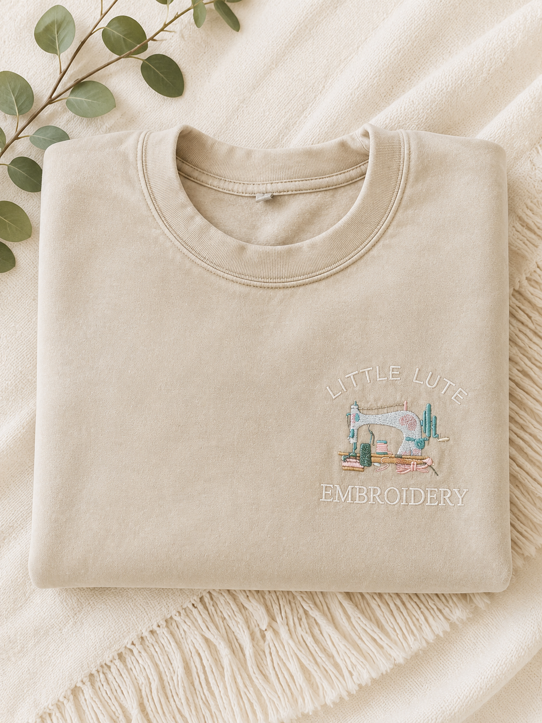
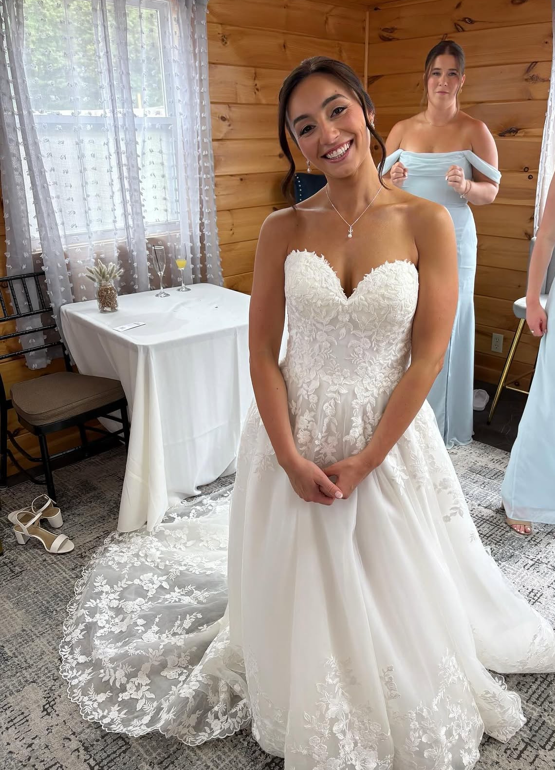
Little Lute Studio combines personalized embroidery with mobile spray tanning. The site needed to make that split immediately understandable, give each service a clear path forward, and keep the personality that makes the business memorable. The design leans into the contrast instead of hiding it.
Small-business websites often lose people by trying to say everything at once. This project was designed around four common problems from the start.
Visitors needed to understand both sides of the business immediately and choose a path without digging through navigation.
The design needed to feel polished without turning a personal local business into something generic or overly corporate.
The oversized type, service split, imagery, and calls to action had to stay intentional on the screen most customers would use first.
Every expressive moment still had to guide people toward the correct service, information, and booking path.

The visitor should understand the business before they have to think about navigation. Big type, distinct imagery, and the “choose your side” concept turn the unusual service mix into the idea.
The typography and composition are intentionally editorial and a little off-center. The goal was not corporate polish. It was a site that still feels like a real person made the business.
The layout is treated mobile-first so the oversized type, imagery, and service split still feel designed when there is almost no horizontal room to work with.